Google Maps design change: Former designer calls it ‘less human’
Elizabeth Laraki, who is said to have helped Google build the Maps, said that the new colour scheme that Google has used, made the app look "colder, less accurate and less human."
Hyderabad: Google maps has recently rolled out a new update with different colour schemes and one of the designers who was instrumental in bringing out the initial Google Map 15 years ago, is not quite impressed with the new design.
Elizabeth Laraki, who is said to have helped Google build the Maps, said that the new colour scheme that Google has used, made the app look “colder, less accurate and less human.” According to her current work profile, Elizabeth has led design teams and shaped multiple core products as Facebook, Google and YouTube.
The designer took to X (formerly Twitter) to say, “Fifteen years ago, I helped design Google Maps. I still use it every day. Last week, the team dramatically changed the map’s visual design. I don’t love it. It feels colder, less accurate and less human . But more importantly, they missed a key opportunity to simplify and scale.”
Highlighting how Google Maps now shows roads in grey, water bodies in teal and parks in mint green, Laraki said, “It seems the goal was to improve usability and make the maps more readable. Admittedly, I do think major roads, traffic, and trails stand out more now. But the colors of water and parks/open spaces blend together. and to me, the palette feels colder, and more computer-generated.”
Pointing out at the “information overload” on Google Maps, she said that it could be more helpful for users if some of these elements that are cluttering the screen could be hidden somewhere in the app.
“So much stuff has accumulated on the top of the map. Currently there are 11 different elements obscuring it: Search box, 8 pills overlayed in 4 rows, a peeking card for “latest in the area”, a nav bar. (Personally I would LOVE to see usage of metrics for these overlays.),” she said.
The map should be sacred real estate. Only things that are highly useful to many people should obscure it. There should be a very limited number of features that can cover the map view. And there are multiple ways to add new features without overlaying them directly on the map, she added.
“It’s normal for products to accumulate features over time. But it’s also super important to stay vigilant and continually clean them up. In many ways, it’s interesting to see history repeating itself.
In 2007, I was 1 of 2 designers on Google Maps. At that time, Maps had already become a cluttered mess. We were wedging new features into any space we could find in the UI. The user experience was suffering and the product was growing increasingly complicated. We had to rethink the app to be simple and scale for the future. It seems like it’s time for Google Maps to do this again…” said Elizabeth Laraki recollecting her time as a designer.
Do you agree with Laraki? Do you also feel Google Maps is too cluttered now and could be simplified?
Related News
-

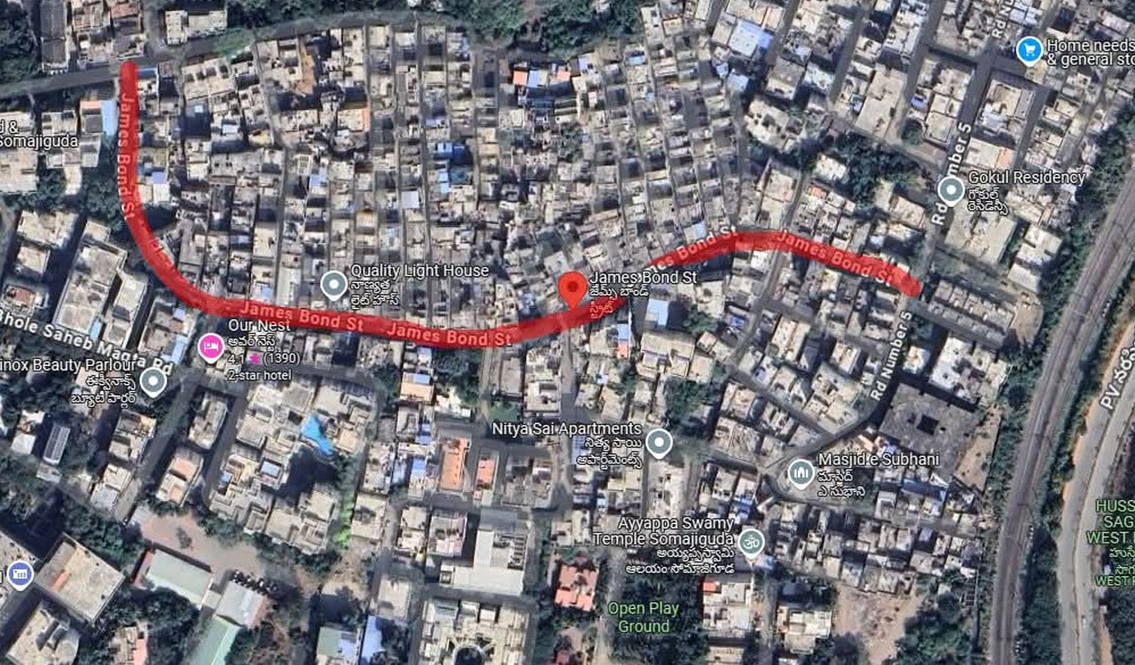
Hyderabad’s ‘James Bond Street’ that exists only on Google maps
-
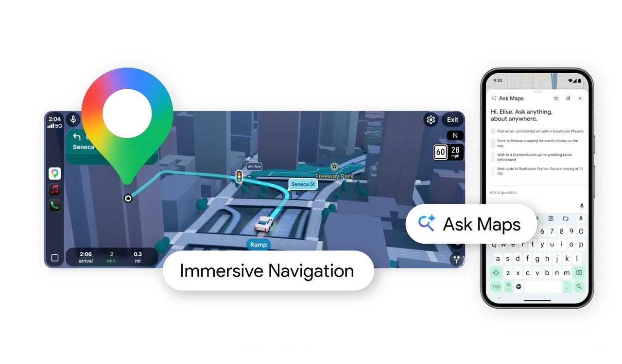
Google Maps introduces AI-powered ‘Ask Maps’ and immersive navigation upgrade
-
Worried about data tracking? Here are some open-source alternatives for all Google apps on your phone
-
Google Maps gets Gemini-powered upgrade with hands-free conversational navigation